After a “slight” break Behind the Cover is back with an interview with Vincent Chong, who designed several covers for Frances Hardinge. This interview is about The Lie Tree, published by Amulet Books.
How did you become a designer and illustrator? Were they areas you always wanted to explore, or did it simply happen?
I’ve always enjoyed creating art as long as I can remember and loved to draw as a kid. So when I realised that it was possible to earn a living as an artist I don’t think I considered doing anything else, but it wasn’t always clear what area I’d pursue. At one point, I was very interested in 3D animation and even wrote off to companies such as Pixar for advice! After school I did a year’s art and design foundation course which allowed you to experiment and explore different areas of art. During this, it clarified to me that I was more interested in illustration/design rather than fine art, and it was at this point I started considering becoming an illustrator. But from there, rather than do a specialist illustration degree at university I chose to do a broad graphic design course which allowed you to specialize in illustration later on. This proved to be a good decision for me as it allowed me to pick up design skills and knowledge that really help me with my work now.

How was the process of developing the cover? Was there a clear goal in mind?
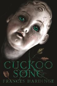
I’d already done another Frances Hardinge cover for the publisher (The Cuckoo Song) which was received well, so they wanted to keep to the same design approach for this with the focus on a single object on a black background. When the art director commissioned me, she already had a few initial ideas that she wanted me to explore, including a tree with swirls of lies around it; a piece of fruit with a bite taken out of it; a rotten fruit with lies scratched into its side. So I played around with these ideas doing some quick rough sketches to visualize their suggestions as well as giving my own slant on these concepts.
(Click the images to make them bigger)


How was the author involved? Was there some back and forth conversation with Frances Hardinge, any ideas or suggestions?
I only liaised with the art director and had no contact with the author myself, so I’m not sure if they consulted her during the cover process at all or just presented it to her when it was finished.
Do you have pictures of earlier designs?
Here are the thumbnail sketches for the various ideas. Of the initial sketches they really liked the approach of 1D and 2A/B. They felt that the cover image should feature some sort of tree element so they wanted me to combine these two concepts and I went on to produce a few more quick roughs to play around with ways of how this could work.


From your experience, does the publisher have the final say regarding the design of the book, or does the designer (and in some small ways the writer) have free rein?
In my experience, typically the publisher does have the final say when it comes to the design of the book rather than the designer. Usually, the bigger the publisher, the more people there may be involved in the process, from the design and editorial teams, to the publisher and marketing department. There’s even been instances when the book buyers have had an influence on the final cover design. Depending on the project the author has varying degrees of involvement; some times the author may be consulted throughout the design process and invited to suggest ideas and give feedback and other times they might not be involved at all. Over the years, I’ve been lucky enough to have gotten to work with a range of big publishers and smaller presses and indie publishers; the smaller publishers have smaller budgets and might not be able to pay as much, but usually I’ll get to have more creative freedom so those projects can be very fun to work on. With self-publishing becoming more popular in recent years I’ve also been commissioned by writers themselves and so in those instances it’ll usually just be me and the author involved in the cover design.
Was there anything particularly different or interesting about this book cover, interesting facts you’d like to share?
In the original finished version the apple was completely red. However it later came back that they wanted me to add a touch of green to the apple as they wanted to push it even further away from the Twilight book cover which also has a black background and red apple.


Finally, what are some of the favourite book covers that you’ve seen (recently or not), from other designers and illustrators?
I find that I’m often more drawn to the covers of children’s books which can have some fantastic illustrations. I love the covers for the latest UK editions of the Harry Potter books which feature artwork by Jonny Duddle who I’ve been a fan of for a while now. I’m also a big fan of John Rocco’s work – he’s done a lot of covers for fantasy adventure books such as the Percy Jackson series. A few years ago at a Con I came across Canadian publisher Chizine Publications. Their books caught my eye straight away as they’ve got some wonderful cover designs. If you haven’t seen them before you should check them out.


Thank you Vincent for this interview! Don’t forget to check out his portfolio, and in the meanwhile, here are other projects Vincent has worked on: