

Today’s interview ties in with the last one! Duncan Smith is here to talk about Howl’s Moving Castle by Diana Wynne Jones, published by Harper Collins, as well as other books he’s worked on by the same author.


How did you become an illustrator? Was it an area you always wanted to explore, or did it simply happen?
Well, when I was a kid, I wanted to be a cowboy, then I found out about Space so, I had to be an astronaut! Then, James Bond, Tarzan, and then finally Batman! (The Adam West version not the guy in the rubber suit!)
I always loved drawing, but never thought you could make a career out of it, until my art teacher told me about The Glasgow School of Art! So that’s where I headed and had a wonderful time meeting like mind folk and learning all they could offer! After I graduated, I moved to London, and knocked on every Publishers door dragging along my portfolio until finally someone gave me a job, and so in a nut shell, that’s how I became an Illustrator!
How did you get involved with these covers for the Howl’s Moving Castle series? Did HarperCollins contact you directly, or did they already know your work?
I got a call from Nina Tara, who was working at Harper Collins at the time. She told me all about the project (I’d worked with Nina on stuff before) and it sounded great. Nina’ is one of the best designers around, she gives you detailed briefs and loads of suggestions but leaves room so you can add your own creative flair.


How was the process of developing the cover (the typography, the illustrations…)? Was there a clear goal in mind?
The Type was already worked out by Nina and she’d worked out a brilliant concept for the cover. The idea was that silhouettes of the characters and elements from the story would be dotted around the type, or on top and reversed out inside the type. I knew where Nina wanted the images to go, so after reading through the book, I quickly started doing tons of little sketches and Nina would drop all of these in place and we would go back and forth like this until it all came together.

How was the author involved? Did you get a chance to speak with Diana Wynne Jones at the time, did she give any suggestions or ideas?
As far as I know she really liked them. I didn’t speak to her and I’m not aware that she had any input for the redesign.
Do you have pictures of earlier designs?
No, not earlier designs for the front cover, but I think I did some different sketches for the back, before we settled on the solid black drawings to encompass all the blurb.
From your experience, does the publisher have the final say regarding the design of the book, or does the designer/illustrator have free rein?
Well, the publisher always has final say, but it really is a load of people involved, from reps from bookshops, marketing and sales folk, the list goes on, but once the designer presents the idea and it’s approved, then the illustrator gets a chance to do their ‘wee bit’!
Was there anything particularly different or interesting about these illustrations, interesting facts you’d like to share?
Because the silhouettes were going to be tiny there really wouldn’t be any room for much detail. So, I had to keep everything pretty simple, it was a challenge trying to give them some character and a sense of fun.
Finally, what are some of your favourite book covers, whether they’re recent or not?
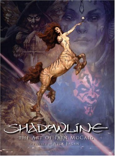
There’s so many covers to choose from, let’s see, a great one is by my good friend Iain McCaig – Shadowline; Crazy River, Nina Tara; or anything by Mike Mignola – Baltimore.


Thank you Duncan for your time!
As is usual, here are some other works by Duncan, and you can check out his portfolio for more!


Best found treasure trove on the internet! What awe inspiring talent you have!