

This week we welcome Sarah J. Coleman to the blog! Sarah has done some amazing work with typography and book covers, and as examples we have The Assassin’s Curse by Cassandra Rose Clarke, published by Strange Chemistry, and Aristotle and Dante Discover the Secrets of the Universe by Benjamin Alire Sáenz, published by Simon & Schuster.
Sarah graduated from the University of Central England (then called Birmingham Polytechnic) with a first class honours in Illustration, and she also won an award for her experimental typography. She made a lot of relevant contacts while doing research for her final project, and this led to her first pieces of commissioned work outside of college, as well as a job at the Royal Shakespeare Company.

How did you get involved with this cover? Did Simon & Schuster contact you directly, or did they already know your work?
My New York agent Bernstein & Andriulli, was contacted by Simon & Schuster.
How was the process of developing the cover (collaboration between photography and typography)? Was there a clear goal in mind?
They had an idea in mind and sent several example of my work that resonated with them for this cover, particularly ‘Amethyst Child’.

How was the author involved? Was there some back and forth conversation with Benjamin Sáenz, any ideas or suggestions?
He wasn’t!


How did you get involved with this cover? Did Strange Chemistry (Angry Robot) contact you directly, or did they already know your work?
Angry Robot, the publishers, they got in touch but via my London agent, CIA.
How was the process of developing the cover? Was there a clear goal in mind?
Yes, but I had quite a lot of leeway to come up with something. Again they knew what they had seen and liked about my work so I knew what my parameters were.
How was the author involved? Was there some back and forth conversation with Cassandra Clarke, any ideas or suggestions?
She wasn’t! Both authors only approved the final completed illustration.
Was there anything particularly different or interesting about this cover, interesting facts you’d like to share?
I enjoyed doing the research on the specific types of building they’d asked for. And the manticore is female; she needed re-drawing a couple of times.
From your experience, does the publisher have the final say regarding the design of the book, or does the designer/illustrator have free reign?
The publisher’s Art Director ALWAYS has final say of course, but in terms of whether the illustrator is briefed tightly or very loosely varies massively from job to job.
Finally, what are some of your favourite book covers, whether they’re recent or not?
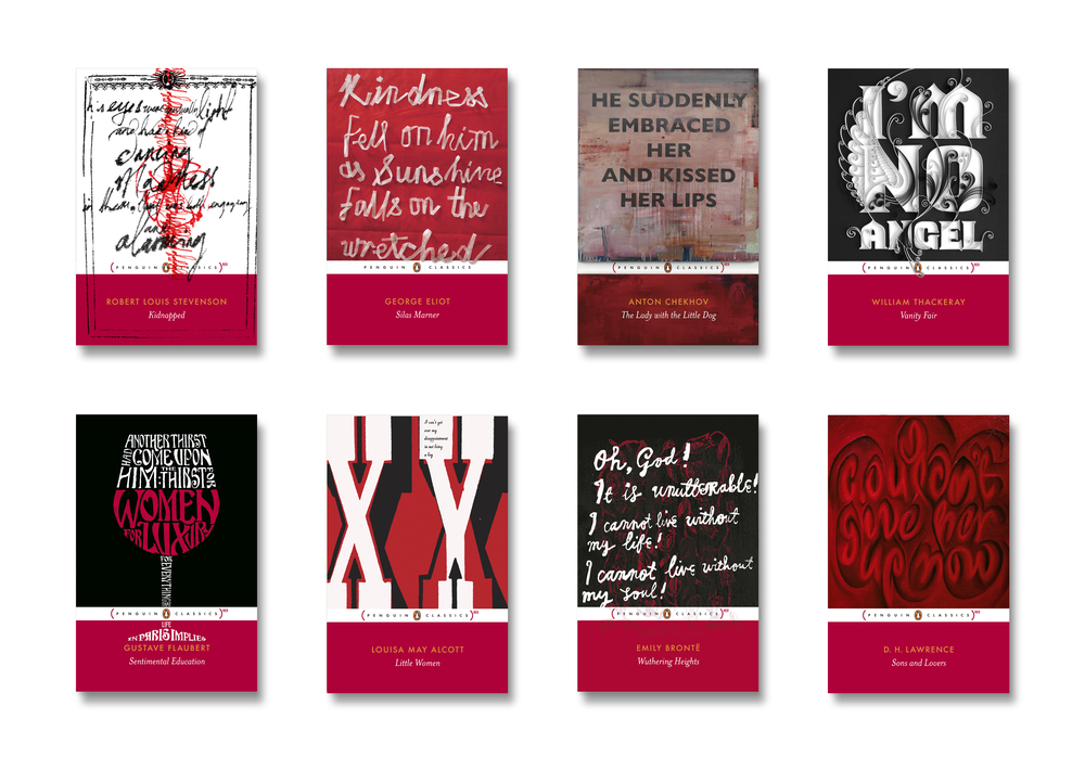
I don’t really have ‘favourites’ as such – I applauded the Penguin Classics clothbound series and the Penguin RED classics. There are too many beautiful covers from history to mention – I have a collection of very old (18th century and upward) books whose covers are all beautiful but I couldn’t pick individuals, and the artist was often uncredited.
Any book which makes creative use of foil, of gold, embossing and traditional bookbinding techniques I will tend to gravitate towards, and also those which take risks and possibly put people’s noses out of joint – such as the recent photographic re-works of Roald Dahl’s books, packaged for an adult audience. A lot of people got very pissed off about those.


Thank you Sarah for your time and for these answers! If you want to see more of Sarah’s work you can go to her website Inkymole.


One Response