Today’s artist, Jon Smith, is the illustrator of The End Games by T. Michael Martin, published by HarperCollins. Thank you for your time, Jon!

How did you become a designer and illustrator? Were they areas you always wanted to explore, or did it simply happen?
As a kid I was really serious about illustrating comic books. I think I was 13 or 14 when i started doing full 10″x15″ comic book pages and taking them to comic book conventions to get critiqued by my favorite artists. It was a fun and enriching exercise because at that time (and it probably hasn’t changed too much now) the only way to make it in comics was to submit samples to publishers and get rejected over and over and get brutally critiqued by artists who have made it because there’s a standard you have to reach to actually get work and they’re not shy about letting you know.
I don’t care how bad it is or how bad I am I just want to know where I stand, y’know?
But anyway everything turned on a dime when I committed to the Art Institute of Seattle out of high school. There’s nothing wrong with the school I just didn’t know what I was getting into. I told them I wanted to be an Illustrator, they told me Graphic Design was the program that fit me best…I didn’t really kow what that was but in my mind there would be bad ass Illustrators teaching me in this school, sharpening my already amazing talent :)
But the reality is, it’s a for profit school that makes money based on placement rates. They get people into their school by showing prospective students and parents thereof the numbers – if you enroll in program X there’s a 75% chance you’ll get a job in that field… whatever the percentage is.
The problem with Illustration is you HAVE to be good to get a job when you graduate, which kills the whole placement rate thing. They can’t make you talented, BUT you can teach people how to use Illustrator, Photoshop, Flash, Indesign yada yada and they should find a job somewhere. So when I started they were phasing the Illustration program out which is why they funneled me into Graphic Design.
When I realized this I wanted to quit but the contract my parents signed for payment (which was a lot!) was irrevocable so it was pretty frustrating, but by the end I started to figure out what design was and how I can fit within it… but I wasn’t really ready to get a real job, I never even applied for an internship anywhere which is weird but I was young and dumb so I fell into doing concert posters randomly which I guess makes sense because it’s not unlike the comic book scene. You throw yourself into it and if you’re good you stick.
How did you get involved with this cover? Did HarperCollins contact you directly, or did they already know your work?
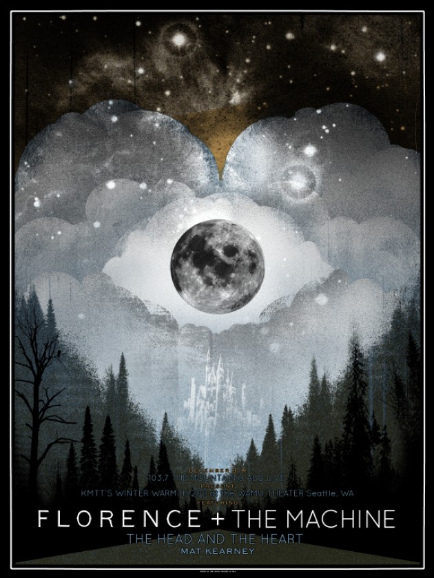
They saw my posters on gigposters.com and contacted me. They were looking for someone to incorporate the type as the main design element. I believe this Eric Church poster is the poster they referenced, and I think Fitz & The Tantrums.
(click on the images to make them bigger)


How was the process of developing the cover? Was there a clear goal in mind?
I just kept throwing (ugly) comps at them with clever usage of type as the main element of the illustration until one stuck. I hate making comps because my stuff doesn’t make any sense or look right until it’s fully fleshed out. It was a fun process though, I love the work and my art director at HC is the best. We have a lot of fun in the Email exchange.
How was the author involved? Was there some back and forth conversation with T. Michael Martin, any ideas or suggestions?
T. Mike (I’m sure I’m the only one who calls him that) wasn’t directly involved, which is good. Having channels is good for the process because there’s the publishing/sales side and then there’s the author and the editor. So I submit comps and whatnot and then wait for the feedback after HC/sales and T. Mike and his editor have talked it over. That process repeats until everyone’s happy.
On the next book with T. Mike I went rogue and contacted him without telling anyone, which can be dangerous in that it can complicate things but I was mostly just asking about particular details of the story. I wanted to make sure I understood and whatnot and I think we both respected the fact that too much back and forth could gum up the process.
From your experience, does the publisher have the final say regarding the design of the book, or does the designer/illustrator (and in some small ways, the writer) have free reign?
The book is a product, at the end of the day, and the publisher is the seller of that product so they have to get what they need so I’d say they have the strongest hand in the stirring of this creative stew. But HC, in my experience, has been good at balancing their needs with the authors needs.
Was there anything particularly different or interesting about this illustration, interesting facts you’d like to share?
I think it does a good job of including a lot of aspects in one image, the brothers, the dark creepy backwoods, the mountains and the zombies. I think it works for the most part, blending the photorealistic elements (the boys in the foreground and the mountains in the background) with the stark silhouette graphic of the trees but in a way the detailed illustration of the brothers goes against the grain of how “designy” the other 90% of the cover is. I guess it just leaves a little bit less to the imagination…but that’s nit picky, they are small and you can’t see their faces or anything.
Finally, what are some of your favourite book covers, whether they’re recent or not?
Wow. I don’t even know where to begin. Going back to the comic book thing that was my strongest influence as a kid, that Scholastic pamphlet that would come to school with just the cover images and brief description of new books always made me drool. I ordered books based on the covers alone… mostly Goosebumps and Calvin and Hobbes as I recall.
And the covers of movies and video games at the video store as well.. and as an adult of course posters have pretty much consumed my creative life. I’m bad at picking favorites but I’d have to say the stuff I like best is all the old pulp/scifi/noir stuff from the 50’s and 60’s. From the amazing painted stuff to the clever minimalist design, all very very fun.


Thank you Jon for these amazing answers!
I do agree that college/university can teach you the basics and how to work with certain software, but teaching you how to be good is very hard. That you have to learn mostly by yourself, because it only comes with hard work and dedication.
You can see more of Jon’s work on his portfolio and GigPosters website.